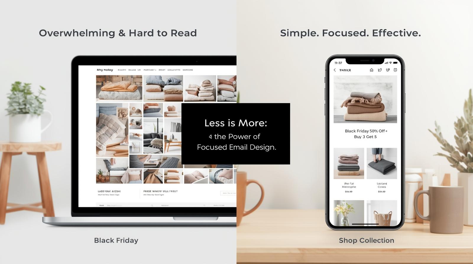
If you’ve ever opened a brand email and had to scroll… and scroll… and scroll some more — you know how it feels.
Rows upon rows of product images, buttons, and banners, all competing for attention.
For many eCommerce brands, the instinct is to show everything you’ve got. After all, the more products you feature, the better the chance someone finds something they like… right?
Not exactly. In fact, the opposite is often true.
The Problem With “Catalog Emails”
Packing too many products into one email can actually hurt performance.
Here’s why:
- Decision Fatigue – When shoppers see too many options, they freeze. Instead of clicking, they scroll — and eventually exit.
- Visual Overload – Too many sections make your message harder to process, especially on mobile (where over 70% of your opens likely happen).
- Slower Load Times – Heavy image files make emails sluggish. The longer it takes to load, the higher your drop-off rate.
- Weaker CTAs – With multiple “Shop Now” buttons, you dilute the main action you actually want: the click.
In short: a cluttered email doesn’t look like a brand that knows what it’s selling — it looks like one that’s desperate to sell everything.
Mobile Reality Check
Most subscribers don’t read your emails on desktop. They open them on their phone while multitasking — standing in line, watching TV, or waiting for coffee.
If your email feels long on desktop, it’s twice as long on mobile.
Big blocks of products turn into endless scrolling. Tap targets shrink.
And let’s be honest — who’s scrolling past the first two screens?
Your best content should be visible within 5 seconds of opening.
The Smart Shift: Curate, Don’t Cram
Modern email strategy is about focus, clarity, and click intent.
Your email’s job isn’t to sell everything — it’s to get the click that leads to your website or landing page, where the real browsing happens.
Try this structure instead:
The “Hero + Focus” Layout
- Hero Section – Lead with one bold offer or message.
Example: “Black Friday: Up to 50% Off + Buy 3 Get 5 Blankets” - Product Highlights – Feature 3–4 bestsellers or visuals, not the whole catalog.
Choose your highest-margin or most giftable items. - Call-to-Action (CTA) – One clear direction.
“Shop the Collection” or “View All Blankets” works better than multiple CTAs. - Brand Credibility – Add one testimonial, review, or “As Seen In” logo row.
- Footer / Reminder – Keep it clean with links to collections, not dozens of items.
This modular approach is mobile-first, scannable, and visually balanced.
Why This Works
- Better Click-Through Rates: Fewer choices = stronger intent.
- Cleaner Brand Feel: Your design reflects confidence and direction.
- Faster Load Time: Improves deliverability and engagement.
- Higher Conversions: You’re not asking them to think — just to click.
It’s not about withholding options; it’s about guiding attention.
The email gets them curious. The website closes the sale.
Takeaway
“Emails are not your store — they’re the doorway to your store.”
A long, crowded email tries to do too much.
A focused, well-designed one does exactly what it should: spark interest, invite clicks, and drive real revenue.
So the next time you’re designing a promo email — resist the urge to show every product you have.
Show just enough to make them want to see more.
Want to build focused, high-converting emails fast? Use our Free Email Builder — design mobile-optimized emails and export the code in seconds!
